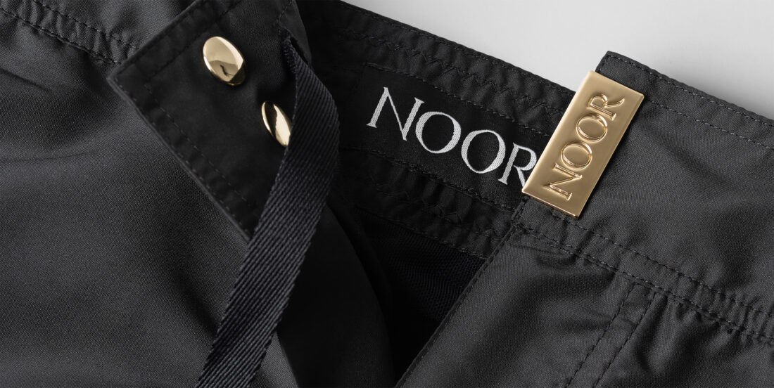
Every so often a project arrives that lets us put our full range of technical skills to work on a single brand: still life, macro detail, and photo-compositing all in one campaign. That was the case with Eli Noor, a Los Angeles–based luxury swimwear and eyewear label built on a simple but powerful idea: Milanese elegance meets California style.
Eli Noor designs swim shorts, sunglasses, beach towels, and resort essentials, all made in Italy, finished with signature 18K gold-plated hardware. For an American brand, that Italian provenance isn’t a footnote, it’s the core of the story they tell their customers. Our job was to make sure the photography told that same story: precise, warm, and unmistakably premium.
The creative brief: translating a mood into light
Eli Noor was a brand new label, still defining its visual identity from the ground up, so there was no existing style guide to follow. We asked the client for reference brands they admired, both for positioning and for photographic style, to build a shared understanding of where Eli Noor wanted to sit in the luxury market. From there, we contributed our own creative direction, helping define the best way to present the swimwear and eyewear in still life: how to light the fabric, how to frame the hardware, and how to keep every shot feeling considered and high-value rather than generic.
This is where a still life and commercial photography approach pays off for a fashion brand: every choice of light, background tone, and shadow density is deliberate, built specifically around the product rather than borrowed from a generic studio preset.
Swimwear: technical still life on custom prints and fabric
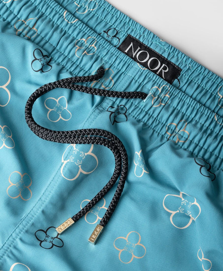
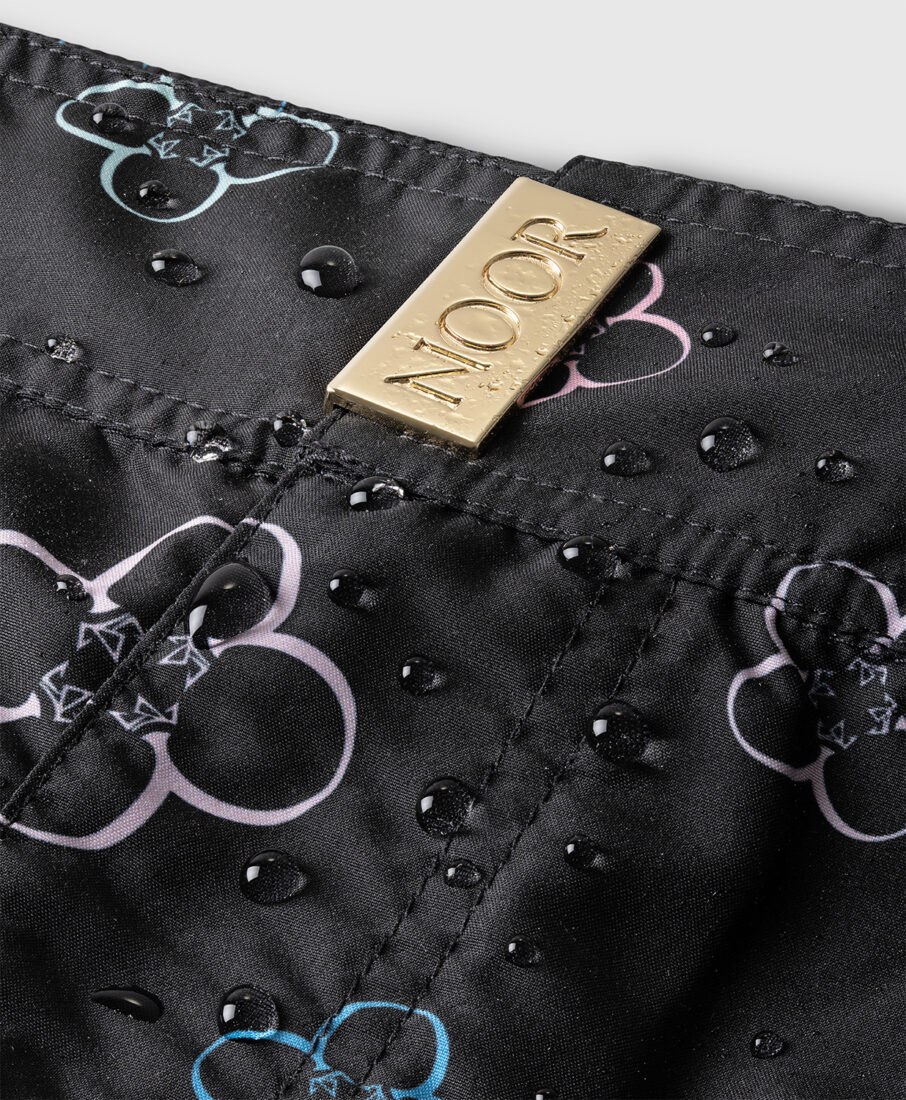
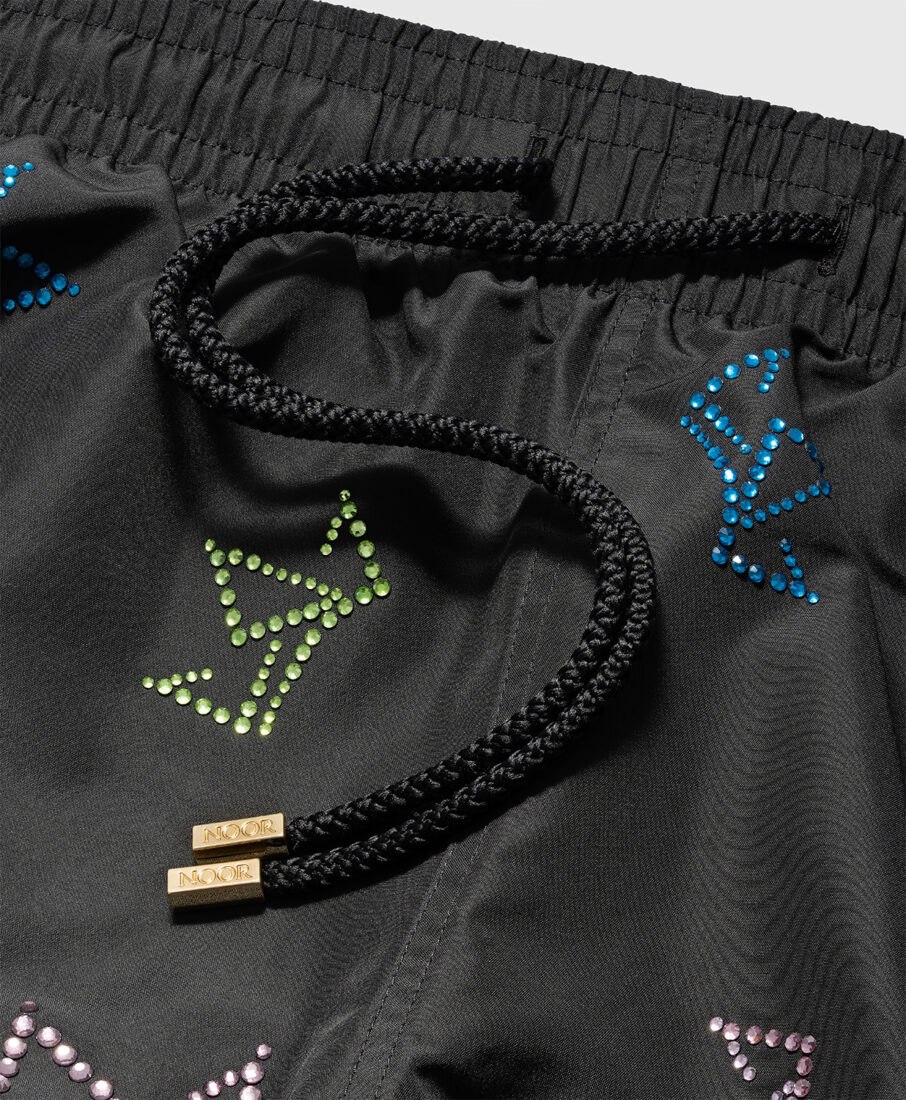
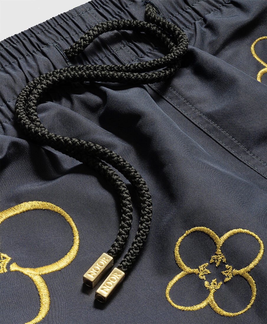
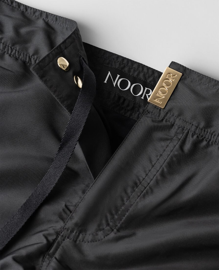
Eli Noor’s swim shorts feature exclusive prints and fabric blends, so the photography needed to do two things at once: show the garment’s silhouette and drape, and preserve the fine detail of the print itself. We paid particular attention to fabric texture and how the light rakes across the printed surface, since these custom patterns are one of the brand’s key differentiators and easy to flatten out under the wrong lighting setup.
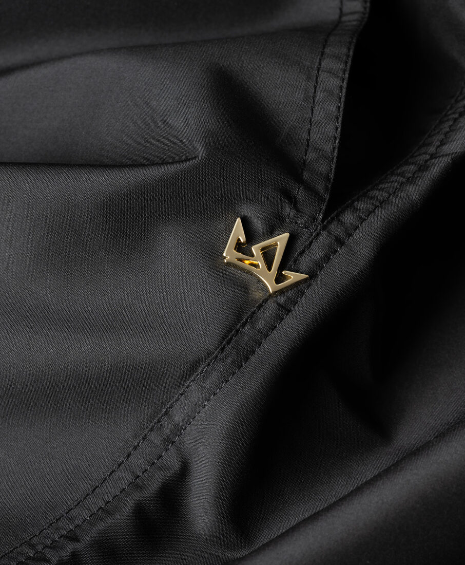
The signature 18K gold-plated hardware shows up here too, on the drawstring aglets and on select embroidered details, so even these smaller accents needed the same careful lighting treatment we’d later apply to the eyewear, keeping the metal warm and legible without letting it compete with the fabric print.
Eyewear: the challenge of 18K gold-plated hardware
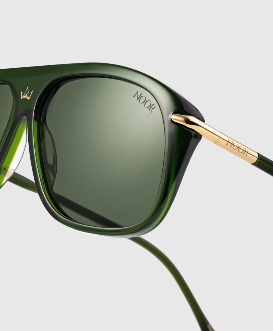
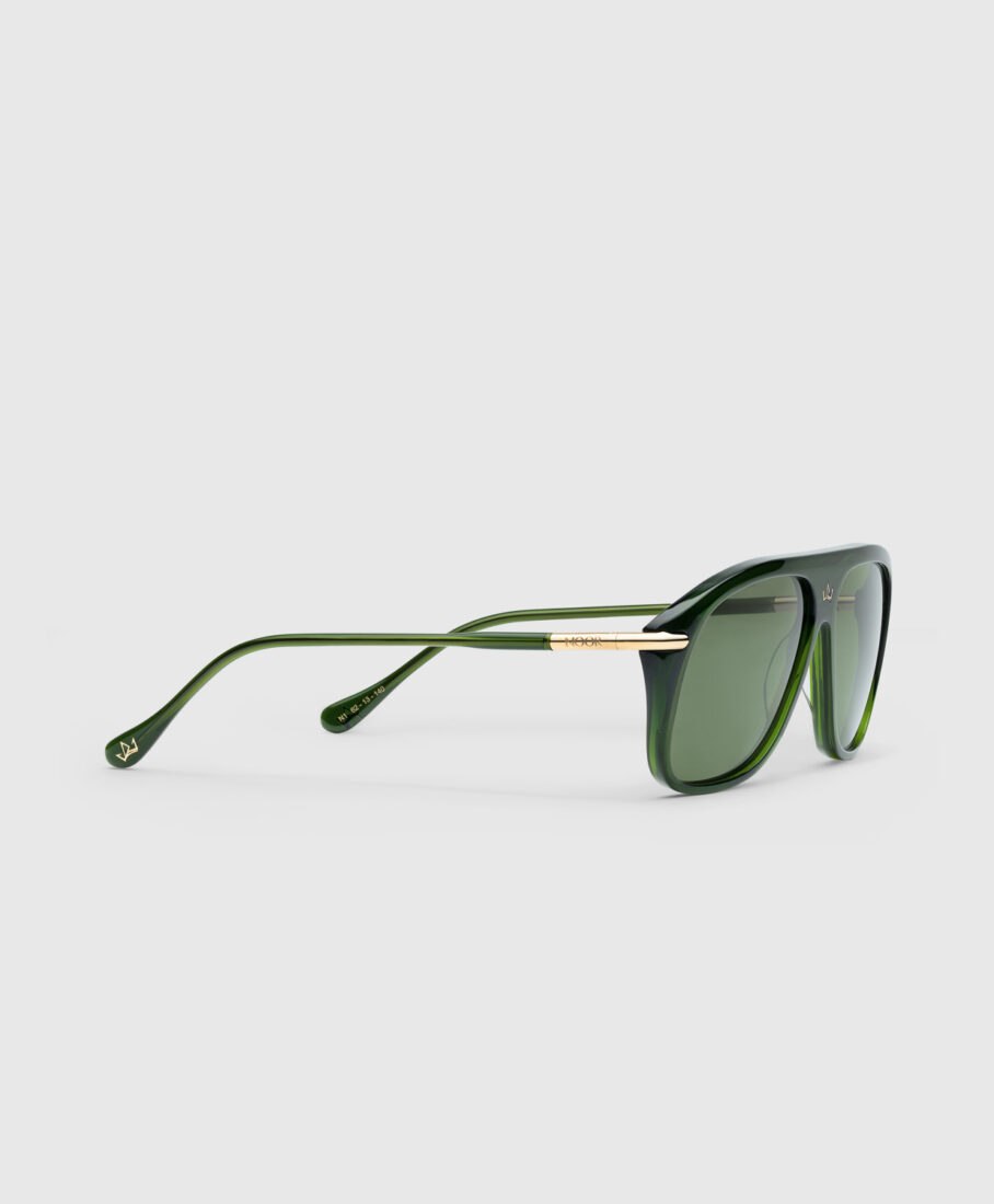
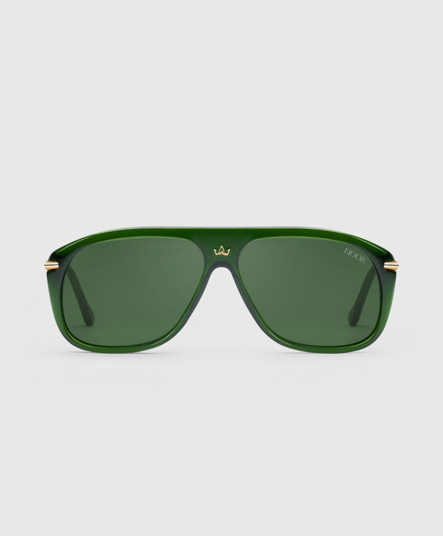
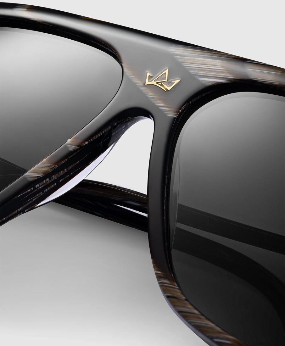
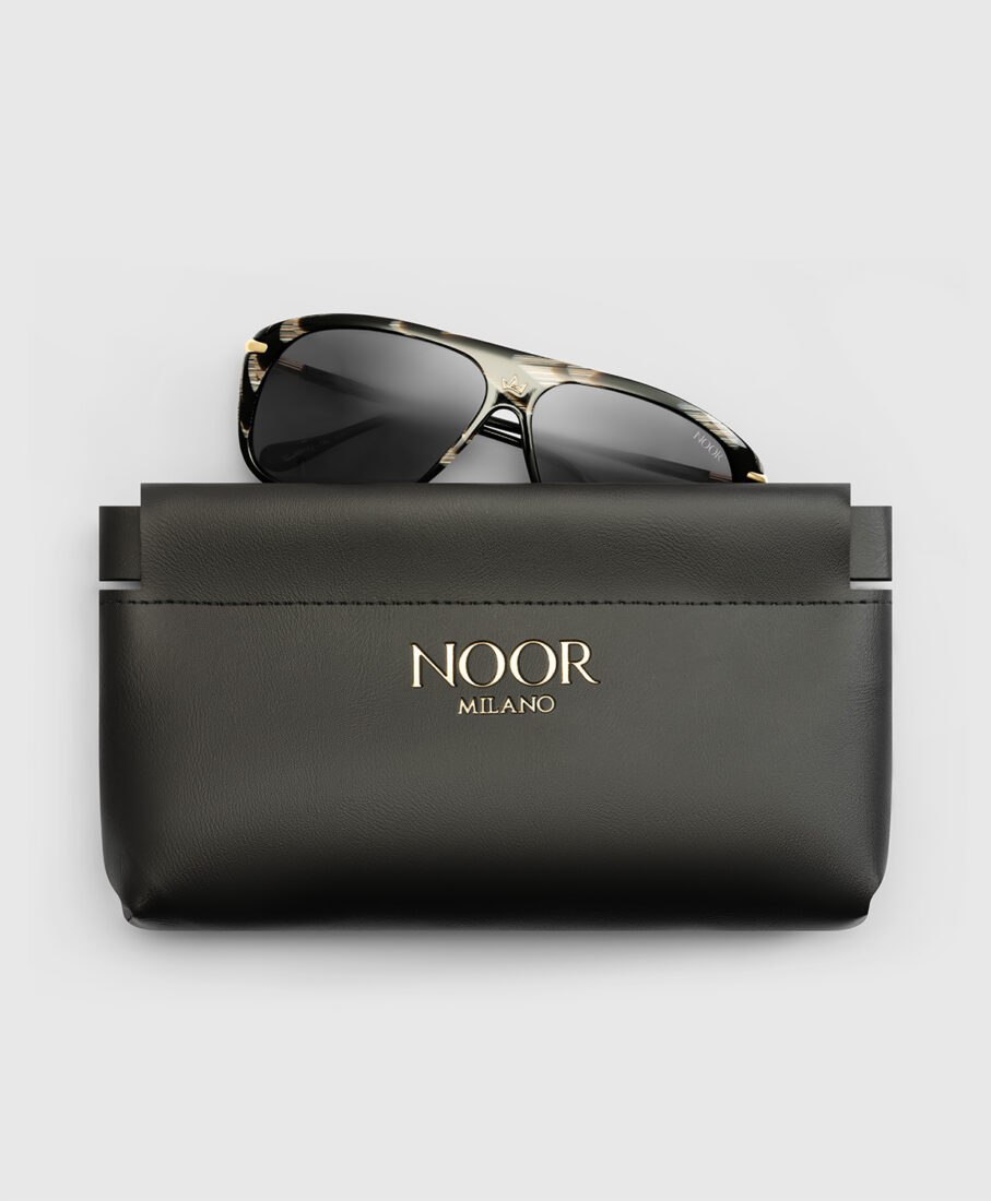
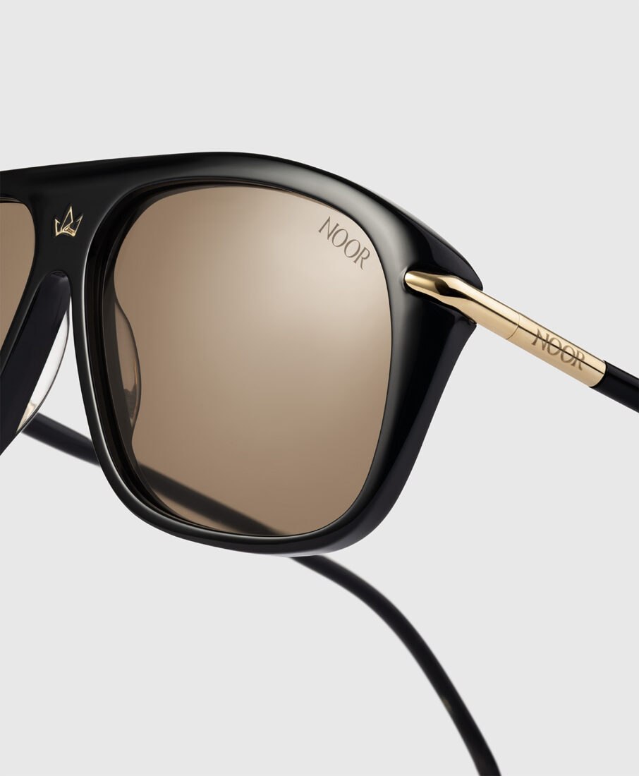
The sunglasses are where the gold hardware plays its biggest role, larger surfaces, more visible engraving, and nowhere to hide. Photographing gold-plated metal is a notoriously difficult technical exercise: it’s reflective, it’s warm-toned, and it needs to read as genuinely metallic without blowing out into a flat highlight or going muddy in the shadows.
We built a dedicated lighting setup specifically for the hardware, layering soft, controlled reflections to bring out the material’s warmth and dimensionality while keeping every engraved detail sharp. This is the same category of problem we cover in depth in our article on high-end retouching, where we break down how reflective and curved surfaces are handled in post-production, gold hardware included.
Towels and accessories: capturing texture at a glance
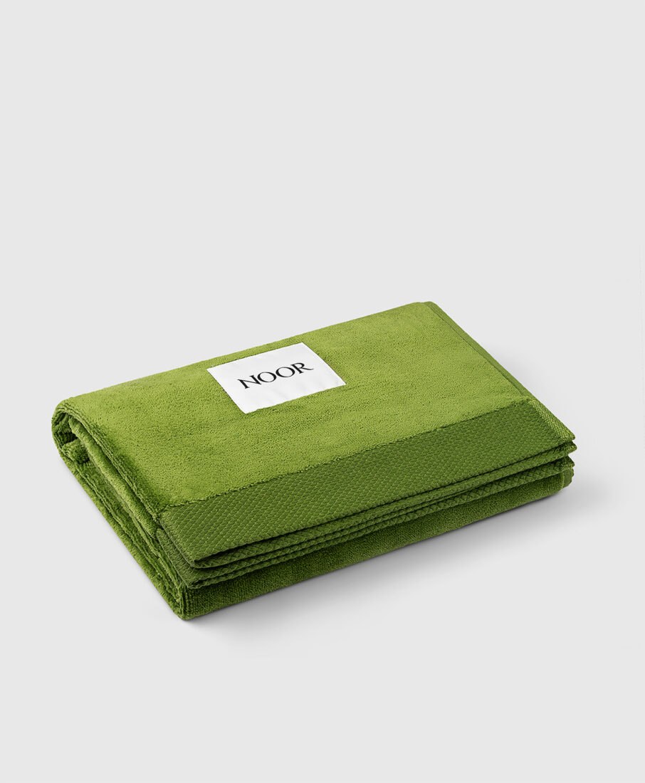
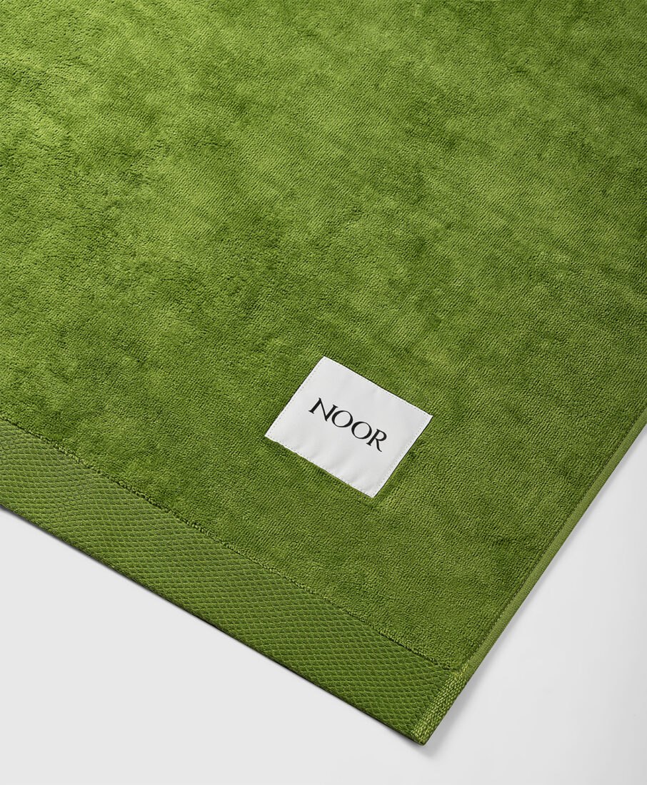
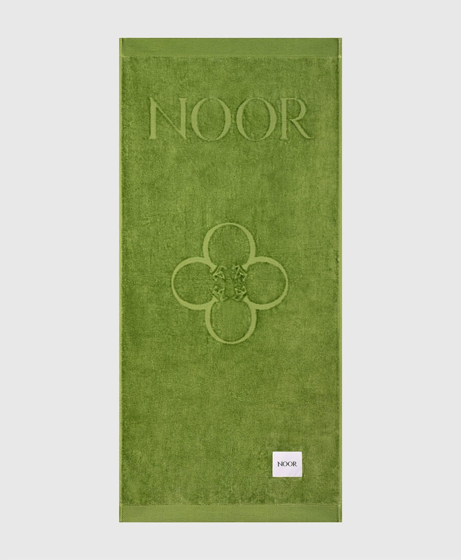
The velour jacquard beach towels and smaller accessories rounded out the campaign. Here, the goal was almost the opposite of the eyewear challenge: instead of taming reflections, we needed to bring out the tactile softness and weave pattern of the fabric, so a customer scrolling through a product page can practically feel the material.
Section-opening visuals: still life meets 3D compositing
For the category-opening images (the visuals that greet a customer at the top of each collection page) we moved from pure studio still life into photo-compositing with 3D and photographic backgrounds.
It’s the same core technique we detailed in our MB Fix case study, where we integrated industrial hardware into realistic home interiors. Here, applied to a completely different brand world, it shows how the same technical foundation, precise masking, matched lighting, and careful color work, can serve everything from industrial components to luxury resort wear.


Why a luxury brand chooses an Italian studio
For a brand like Eli Noor, the Italian provenance isn’t just in the stitching, it’s part of the story sold to every customer. Producing the photography in Italy, with a studio that understands both the technical demands of luxury materials and the visual language of Italian craftsmanship, adds another authentic layer to that narrative.
If you’re building a luxury e-commerce presence for a fashion or lifestyle brand and want photography that matches the level of the product itself, we’d love to talk about your project.